We’re now living in a world that thrives on data, data, and more data. The rise of the internet and Big Data technology helps us mine thousands of interesting data points about virtually anything that we’re interested in be it traffic routes, pollution, population, and crime rates to pretty much anything under the sun that can be quantified.
Our hunger for data has also led to the rise of the humble infographic, which basically makes data palatable to readers by visualizing it. The popularity of the infographic has increased in leaps and bounds, so much so, that Infographics were voted the most preferred way of delivering information by 84% of companies who have used the medium. Studies have found that the right kind of visualization can help improve retention of data by 4X.
However, in many cases, Infographics and Data Visualization, in general, goes horribly wrong as data is stripped of Context’ in the process of simplifying and reducing complexity. However, this can lead to a chicken and egg situation of people searching for source data of the Infographic due to the lack of clarity and context in the visualization.
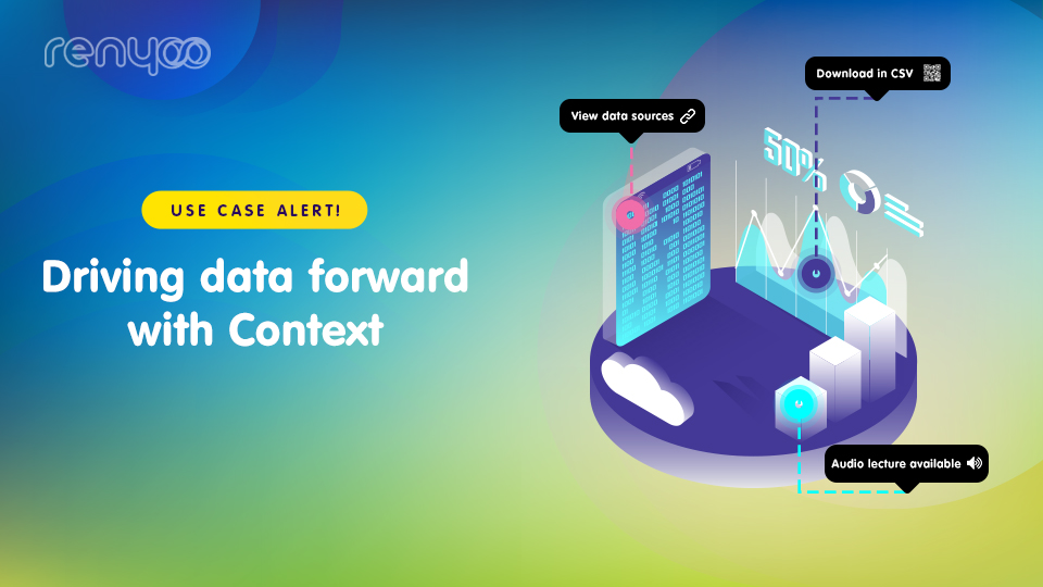
Accurate context can help clear up ambiguity and help readers get the right ‘bigger picture’ or ‘frame of reference’ from your data. We’ve made it much easier for you to add context to such visualizations with ‘Hotspots’, our image annotation technology that helps you maximize every pixel of an image by embedding your visuals with supporting Audio, Video, Text and URLs.
How can annotation help improve your data visualization game?
Leave no scope for ambiguity
Adding context to your visuals in terms of labeling important aspects and elaborating on them helps to guide the viewer to your preferred reading. Hotspot annotation lets you zoom in and create labels on any portion of an image without cluttering it. Viewers can choose to view the explanatory text and gain insights on it based on their level of interest.
For example, this Food map compiled by veteran Data Visualizer Laura Manning compiles the dietary habits of an individual living in Manhattan over the course of a year, it tracks the number of meals, where the meals were had, and the dietary composition of these meals.
We’ve added ‘Hotspots’ to this food map to add another layer of data which are the restaurant’s that these meals were ordered from. This can help people who wish to follow a similar diet plan track down the exact restaurants that were part of this individual’s meal plan.
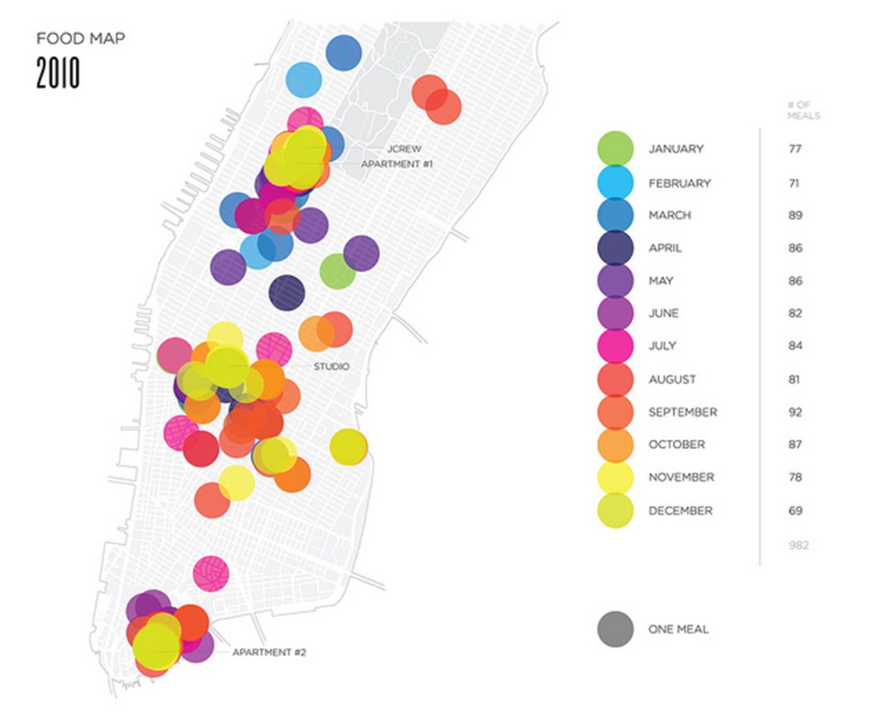
Fig 1.1 (Hotspots link to Yelp pages of the Restaurants that meals were ordered from)
Minimize and simplifies data in layers
Hotspots allow you to minimize data represented on the visual and to keep what is represented to the bare necessities. A Hotspot can be used to ‘Cluster’ a number of data points together. These Hotspots can then be color-coded to classify different kinds of data. Colour coded labels make data easier to understand and process, using color associations such as green for safety and red for danger help increase comprehension even further. In Fig 1.2 color coding is used to represent the type of food consumed over year, allowing the reader to filter out the data that he needs to craft a meal plan. The average calorific value of these meals is represented using Hotspots.

Fig 1.2 (Hotspots link to average calorific value for each type of meal)
Use rich content to aid further research and to drive traffic
You can aid your readers on the right path by providing links to additional materials via hyperlinks. Hotspots allow you to add Audio, Video, and URLs to your images. If you’ve prepared any additional material such as an Audiobook, a Youtube video or if you’ve found an interesting Website that you think might help with additional perspectives on the data, you can add it to your image. This also helps drive traffic to these sources and helps get relevant eyeballs to your content and drive monetization.
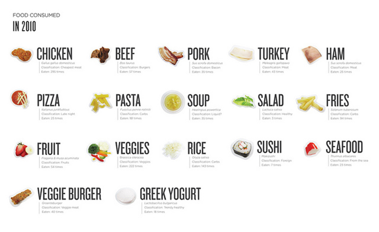
Fig 1.3 (Hotspots linked to Youtube recipes for each type of meal)
Embed sources to add credibility
Hotspots can also be used to give appropriate credit and mention sources for your data. This helps especially when an infographic is compiled using multiple data sources from different websites. It also helps attribute credit without adding unnecessary text directly on to the image.
If you’re interested in how Renyoo can help you create amazing data visualizations for your business – Register for a free consultation now!
